Sale on canvas prints! Use code ABCXYZ at checkout for a special discount!

Welcome to another art blog! My name is Veronica Huacuja, a plastic artist and an online art teacher. I have some good tips for your painting process.
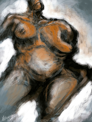
I’m explaining the backstages of the creative production of this artwork. Hope you enjoy it.
The data sheet of the artwork is:
Title: Woman’s Body 25
Artist: Veronica Huacuja
Medium: Digital Art
Size: 5,251 x 7,000 px, 300 dpi
Year: 2018
Collection: Human Body
LET’S TALK ABOUT... An excellent technique: never erase the “mistakes” we make in the process of an artwork, because they might add interesting elements to it. As we may know, this fortunate happening is called “serendipity”, good luck or a fortunate accident. (1)
MATERIAL.
· Digital tablet. I use and recommend one with a hand pressure sensitivity stylus.
· Photoshop (almost any late version of this software).
PREVIOUS THOUGHTS. One thing that we have to keep in mind every time we use the digital medium in our work is that we can do similar procedures in traditional techniques (oil and/or acrylic, etc.).
ART PROCEDURES. I chose a mid-tone (2) for the background, a greenish one (not bright, not dark). This decision helped me to build up the work, because the background color, as we may know, has an important role in the final art solution. This is a technique I use and recommend using: set your background color first. It works just fine!
Sketching with freedom allows us to find interesting solutions. This includes the “mistakes” we do in the way.
With a certain concept of a nude female’s body, I began sketching using the black color and its mid-tones. At first, I didn’t know what the results might be. Little by little, after making various “mistakes”, the body took shape. I uploaded some photos of the creative process that you can find at https://www.patreon.com/posts/never-erase-in-29637463
Then, I added a new color: orange. One way to guarantee that I was using the correct color was to pat it on the surface and see how it matched. After being convinced of the right use of this third color, I applied it on strategic regions, letting the greenish background color still be part of the solution (see the belly, shoulders, legs).
Last, I applied the source of light (that reflects on the figure), and for this purpose I used the white color, which I employed in two ways:
-Lightly on the body just to create the volume.
-Heavily on the background to stand out the body from it, and to create a dramatic contrast with the usage of the black color.
MAKING A MEANINGFUL REFLECTION FROM THE ABOVE: Let’s trust in serendipity while making up our work, and let’s keep our eraser in a closed drawer.
PLEASE WRITE YOUR OPINIONS IN THE COMMENT SECTION. It will generate a very interesting dialogue.
If you find this work interesting and helpful, please FOLLOW my FAA feed (https://veronica-huacuja.pixels.com). Thank you!
Visit any time:
My ART SHOP: https://veronica-huacuja.pixels.com
My BODY OF ART: https://veronica.mx
I offer an ONLINE PAINTING PROGRAM for business groups and individuals: https://veronica.mx/online_painting_course
Hope you enjoyed the work and thank you for reading!
1 https://en.wikipedia.org/wiki/Serendipity
2 https://www.theguardian.com/artanddesign/2009/sep/20/guide-to-painting-mid-tones#:~:text=Mid%2Dtoned%20colours%20are%20in,it%20on%20to%20the%20canvas.
#serendipity, #mistakesinart, #digitalart; #digitalpainting, #art; #patreon; #printmaking, #art, #artist, #artpal, #paint, #artcollector, #oilonpaper. #paiting, #painter, #artcoach, #artcoaching, #learningart, #howtodraw,#howtopaint, #artistic, #paint, #paintings, #howtosketch, #sketching, #drawing #instaartist, #finertamerica #faa, #veronicahuacuja